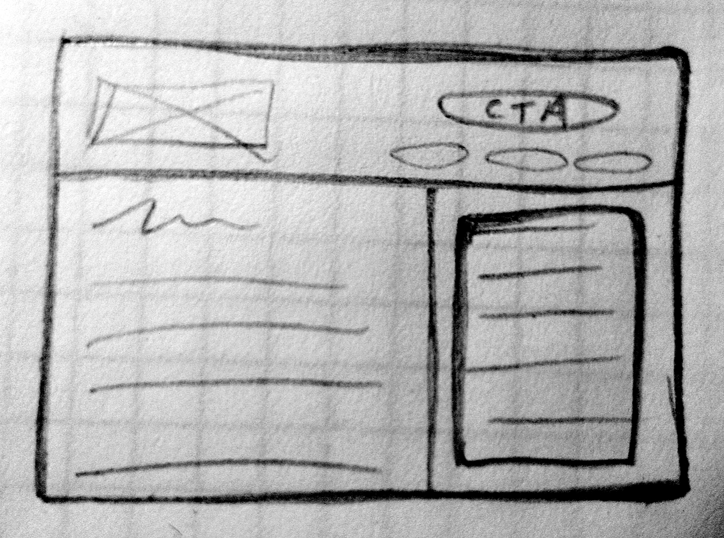
A real layout sketch
Design is not just what it looks like and feels like. Design is how it works.
Steve Jobs
.span-1, .span-2, .span-3, .span-4, .span-5, .span-6, .span-7, .span-8, .span-9, .span-10, .span-11, .span-12, .span-13, .span-14, .span-15, .span-16, .span-17, .span-18, .span-19, .span-20, .span-21, .span-22, .span-23, .span-24 {float:left;margin-right:10px;}
.span-1 {width:30px;}
.span-2 {width:70px;}
.span-3 {width:110px;}
.span-4 {width:150px;}
.span-5 {width:190px;}
.span-6 {width:230px;}
.span-7 {width:270px;}
.span-8 {width:310px;}
.span-9 {width:350px;}
.span-10 {width:390px;}
.span-11 {width:430px;}
.span-12 {width:470px;}
.span-13 {width:510px;}
.span-14 {width:550px;}
.span-15 {width:590px;}
.span-16 {width:630px;}
.span-17 {width:670px;}
.span-18 {width:710px;}
.span-19 {width:750px;}
.span-20 {width:790px;}
.span-21 {width:830px;}
.span-22 {width:870px;}
.span-23 {width:910px;}
.span-24 {width:950px;margin-right:0;}
@for $i from 1 through 24 {
  .span-#{$i} {
    width: $i * 30 + 10 * ( $i - 1 );
    @if $i == 24 {margin-right:0px;}
    @else{margin-right:10px;}
  }
}
$columns: 24;
$column-width: 30px;
$gutter-width: 10px;
@for $i from 1 through $columns {
  .span-#{$i} {
    width: $i * $column-width + $gutter-width * ( $i - 1 );
    @if $i == $columns {margin-right:0px;}
    @else{margin-right:$gutter-width;}
  }
}
@mixin column($columns, $last: false) {
  width: ($column-width * $columns) + ($gutter-width * ($columns - 1));
  @if $last != true {
    margin-right: $gutter-width;
  }
}

@mixin padded-column($columns, $border-width: 0px, $last: false){
  width: ($column-width * $columns) + ($gutter-width * ($columns - 1));
  padding: $column-padding;
  margin-top: $gutter-width - $column-padding - $border-width;
  margin-bottom: $gutter-width - $column-padding - $border-width;
  margin-left: -($column-padding + $border-width);
  margin-right: -($column-padding + $border-width);
  @if $last != true {
    margin-right: $gutter-width - $column-padding - $border-width;
  }
}
div[role="main"]{
  @include column(2.5);
  padding-left: ($column-width + $gutter-width)  * .25;
  padding-right: ($column-width + $gutter-width)  * .25;
  padding-top:1em;
  background:rgba(0,0,0,.2);
  float:left;
}

body>aside{
  @include column(1.5, true);
  padding-left: ($column-width + $gutter-width) * .25;
  padding-right: ($column-width + $gutter-width) * .25;
  display:block;
  float:left;
  background:rgba(0,0,0,.5);
}
@mixin clean-pill-button($background: #666, $height: 48px){
  $shadow: darken($background, 20%);
  background: $background;
  @include background-image(linear-gradient(rgba(255,255,255,.6),
                                            rgba(255,255,255,.4) 50%,
                                            rgba(255,255,255,0) 50%));
  @include box-shadow($shadow 1px 1px 3px,
                      inset lighten($background, 50%) 0px 1px 0);
  color: #fff;
  border: solid 1px $shadow;
  height: $height;
  padding-left:24px;
  padding-right:24px;
  @include border-radius($height/2);
  @include text-shadow($shadow -1px -1px 0);
  &:hover{
    @include text-shadow(none);
    @include box-shadow(inset lighten($background, 20%) 0px -1px 0);
    @include background-image(linear-gradient(rgba(255,255,255,.4),
                                              rgba(255,255,255,.3) 50%,
                                              rgba(255,255,255,0) 50%));
  }
}

$grid-background-total-columns: 10;
$grid-background-column-width: 68px;
$grid-background-gutter-width: 24px;
$grid-background-baseline-height: 24px;
$grid-background-offset:24px;

body{ @include grid-background();}
/
#